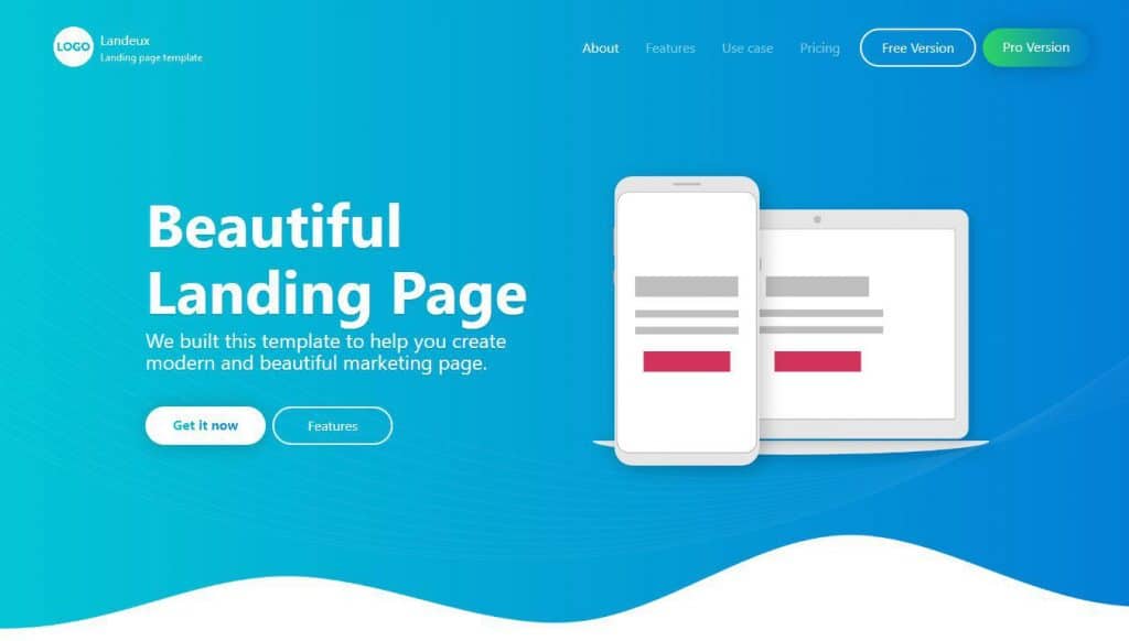
You’ve got traffic on your website but just aren’t converting … what do you do?
Well in this article I shall highlight some strategies which are proven to get those conversions up a league a two! For visitors making a purchase, submitting their details or filling a form, these tips are a sure-fire way to success.

1. First impressions – A strong headline.
The first thing someone sees on your site is the headline, for this reason we have to make it count! Make it stand out, you want to grab people’s attention with an informative, clear and concise opening statement. Perfectly summing up your service and what you have to offer.
2. Supporting Headline.
The supporting headline is exactly that, it supports the primary headline!
This can be an extension of the main headline, like finishing a sentence, or raising a point which supports your primary headline.
3. User friendly language.
Its important that you use language that the visitor can easily digest, not overly complicated or too simplified, remember we want the reader to feel like they can relate to your business.
4. Power words!
Whilst avoiding words that may sound ‘cheesy’ or overly cliché its good to use words that have impact. We want the visitor to feel engaged. Use words that encourage your visitor to take action.
5. Stay real.
These days’ people are put off by overly hyped wording. We’re not being an overly enthusiastic sales person here, we’re being informative. We need a compelling pitch that is honest and to the point.
6. Tell your visitors exactly what they’re gaining.
After a brief introduction to your product in the headers, we need to lay down the details. People need to know exactly what it is that they can look forward to, or exactly what problems you’re going to fix for them. Leave no guess work!
7. Using high quality images.
If you can’t provide good quality images, can you really provide good quality service? C’mon, high res images are a no brainer.

8. Use pictures of happy, smiling people.
It’s proven that images of people smiling have a good impact. Have photos of people using your product in the right context to emphasise the fact that your product works and in turn, will make your visitor happy!
9. Use a video to humanise your brand.
Videos are a great way to make your page seem more ‘human’. They can be emotionally engaging and thought provoking. Just keep in mind that people featured in your video should look happy.
10. Don’t offer too many options.
Ever heard of choice paralysis? Well it’s a real. Giving your visitors too much choice can be confusing and off-putting. It needs to be clear which route the reader needs to take to get what they want.
11. Don’t offer too many options *bonus tip.
The key to success is trial and error, if you offer variations of a service, I.E. basic, medium and pro packages, play around with them and see what works. Try using less options (especially if you have more than three!).
12. Use testimonials!
One of the most important elements to include on your site is the social proof. A study conducted by Zendesk shows that 88& of buying decisions are influenced by reviews.
13. Testimonials *part two.
Reviews from social media platforms are perceived to be the most trust worthy. Landing pages and email opt-in pages are the best places for your social proof.
14. Testimonials *part three.
As well as customer reviews and testimonials, here is a great opportunity to show off any awards from reputable organisations.

15. Brand accreditation.
Working with partners? Why not include a brand accreditation section on your site! This reinforces trust in your business.
16. CTA CTA CTA. (Call to Action).
Visitors need to know exactly what to do next. Lay out clearly, after each piece of content what you want them to do next. Buttons are a great way to do this.
Piece of content -> [Order Now].

17. Try some variation on your CTA.
The styling or wording of your button will have an effect on the ‘clickability’ of your CTA. Experiment and see what works best!
(Avoid this at all costs).
18. Tunnel Vision.
So a visitor is on your landing page. The last thing we want is for them to become distracted by ads or overwhelmed by information! Your landing page should have one clear avenue for the reader to go down. All roads lead to your product.
19. Keep input fields optional.
Not all fields need to be mandatory. Don’t pressure the visitor into giving details which they may not feel comfortable handing over. Only make mandatory what is essential for the next part of their journey with you.
20. Don’t require a registration.
One-time purchases (not requiring sign-up), is a good option to have for your customers, some people just want to get the job done and don’t want all the subscription material that comes with it.
21. Offer multiple payment options.
For me personally, I like to use PayPal. Its easy, quick, it gets the job done.
Its great to have the option for multiple payment types so bear that in mind!

